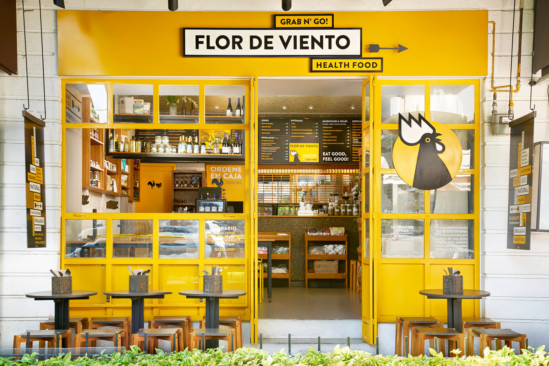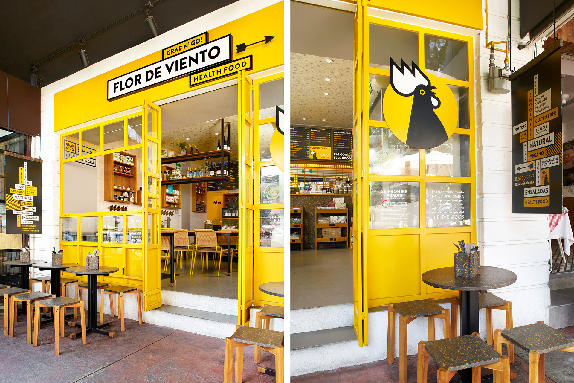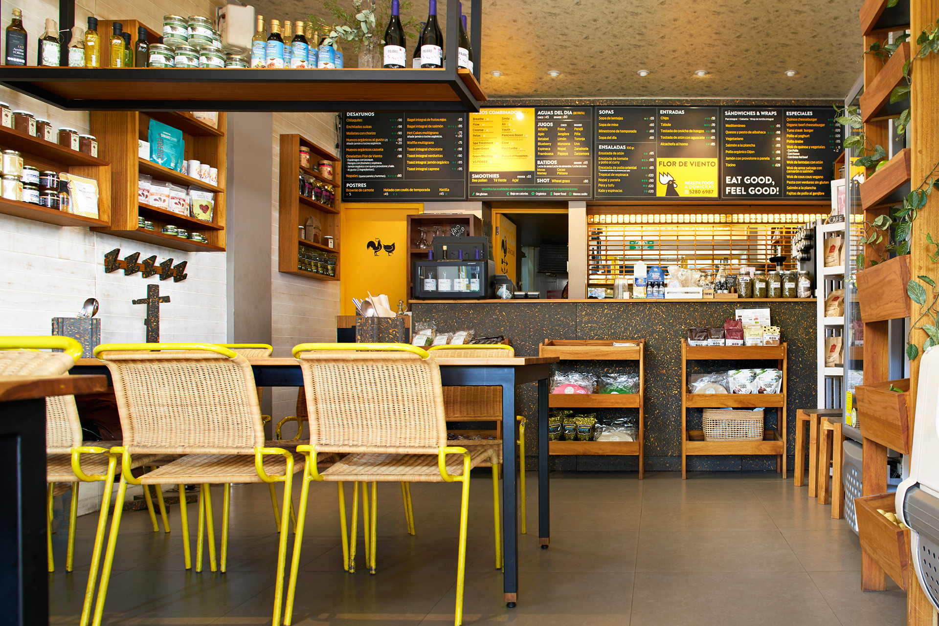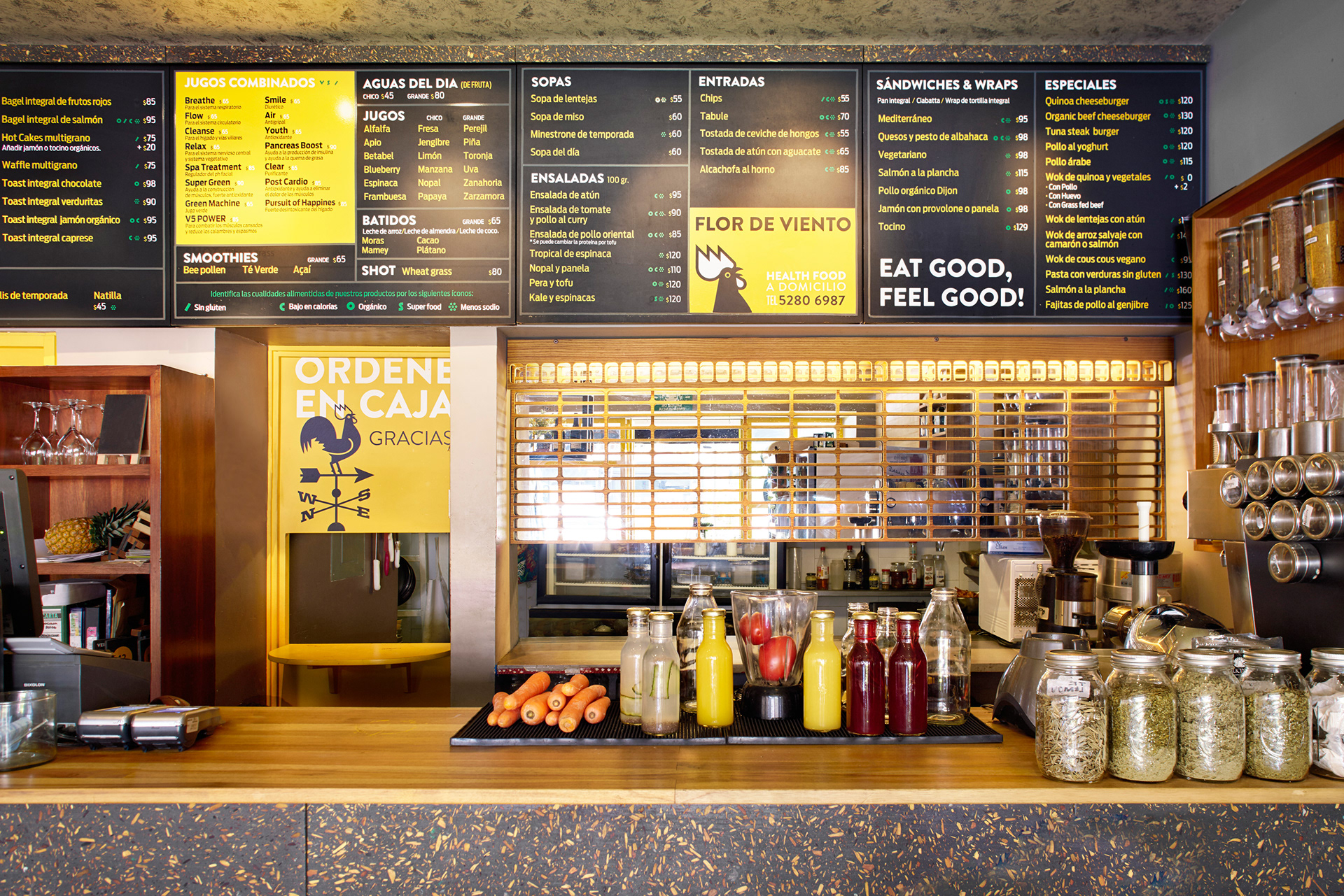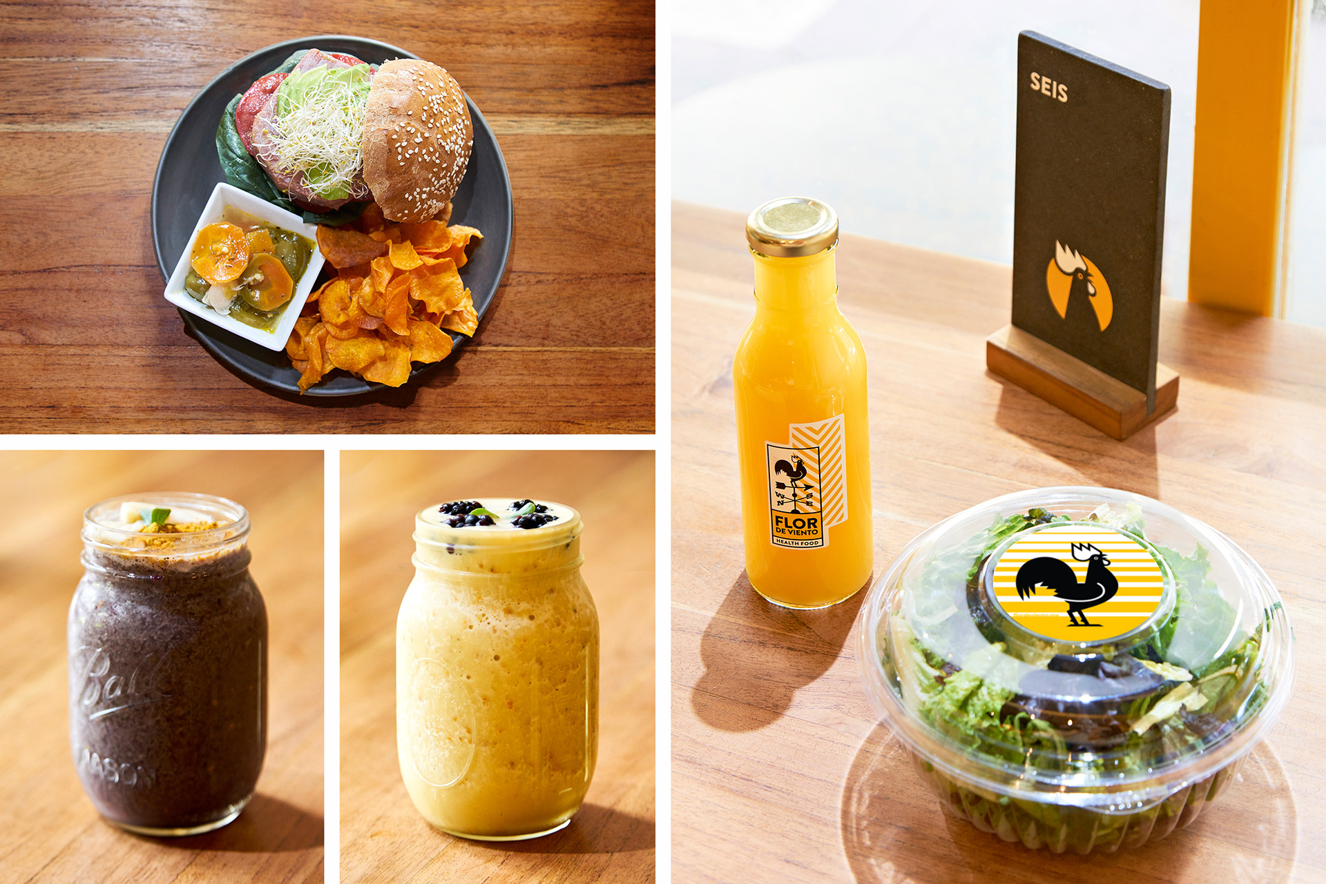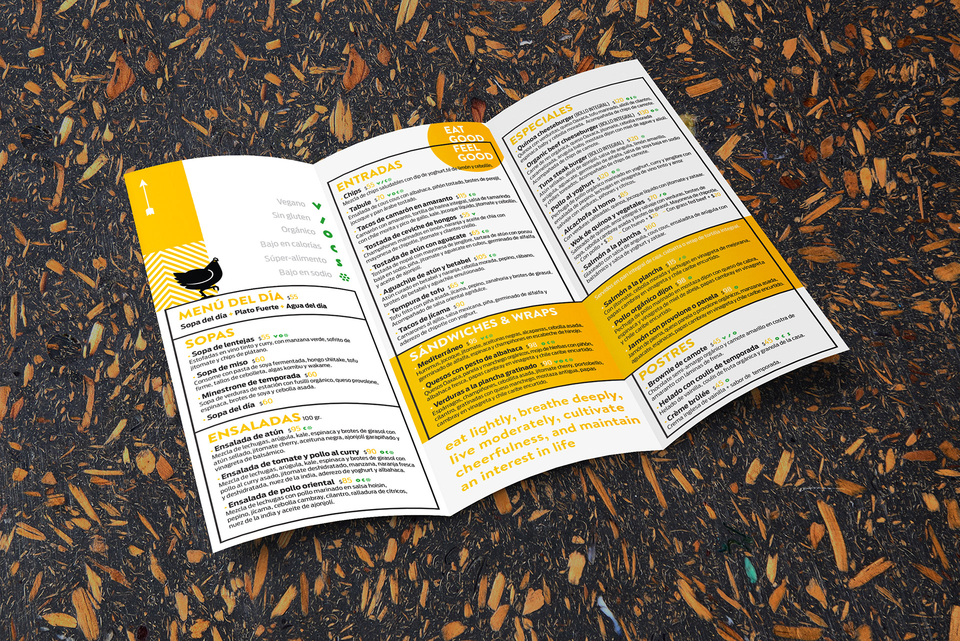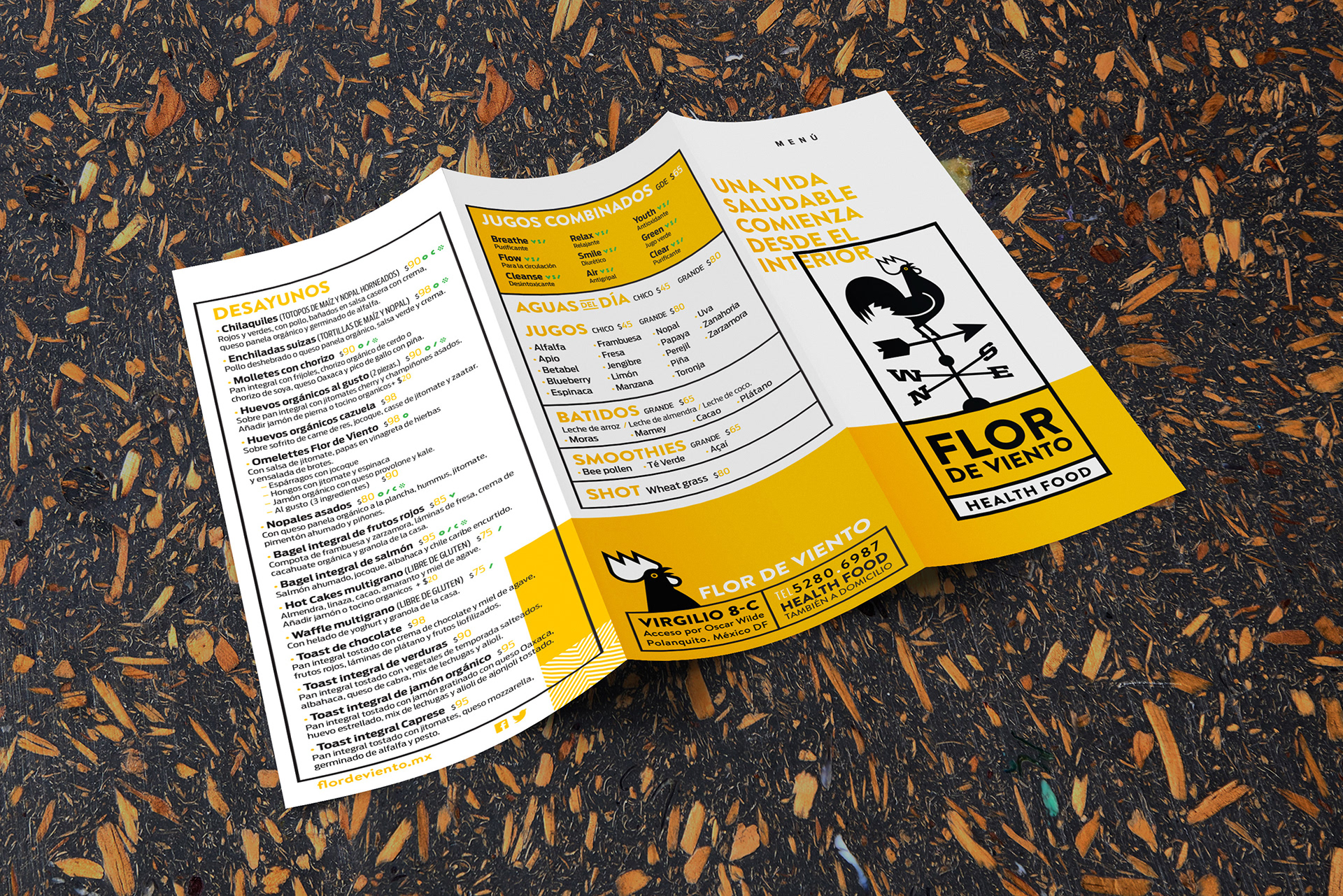
Flor de Viento is a small restaurant that serves organic, vegetarian and health food dishes and cold pressed juices. It is located in Polanco, a very nice upscale neighborhood in Mexico City famous for its trendy shops, galleries and restaurants.
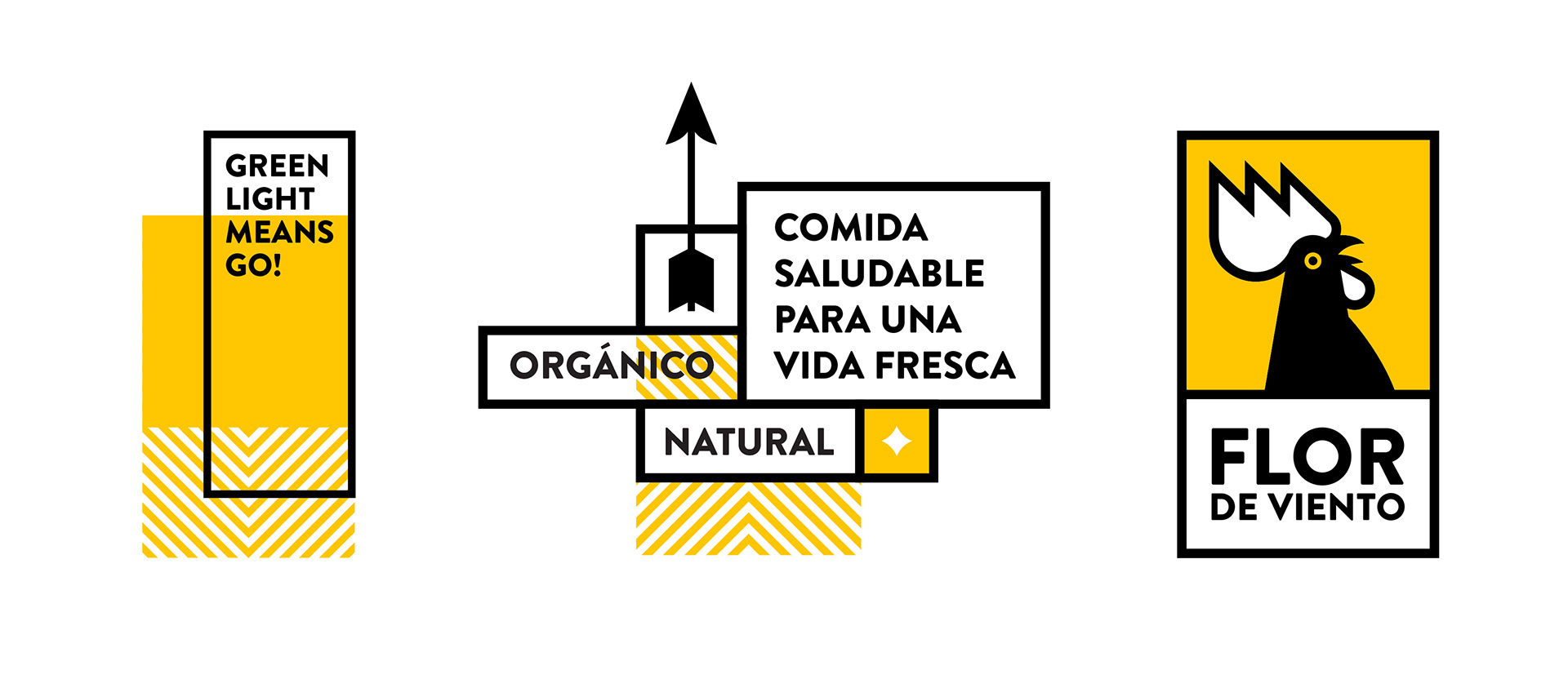
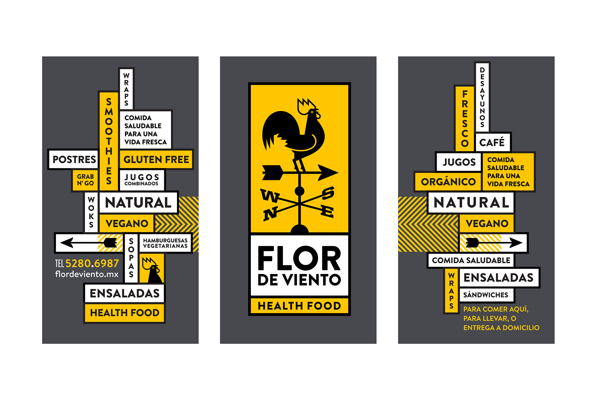
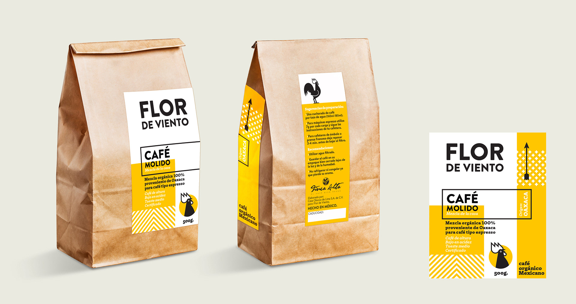
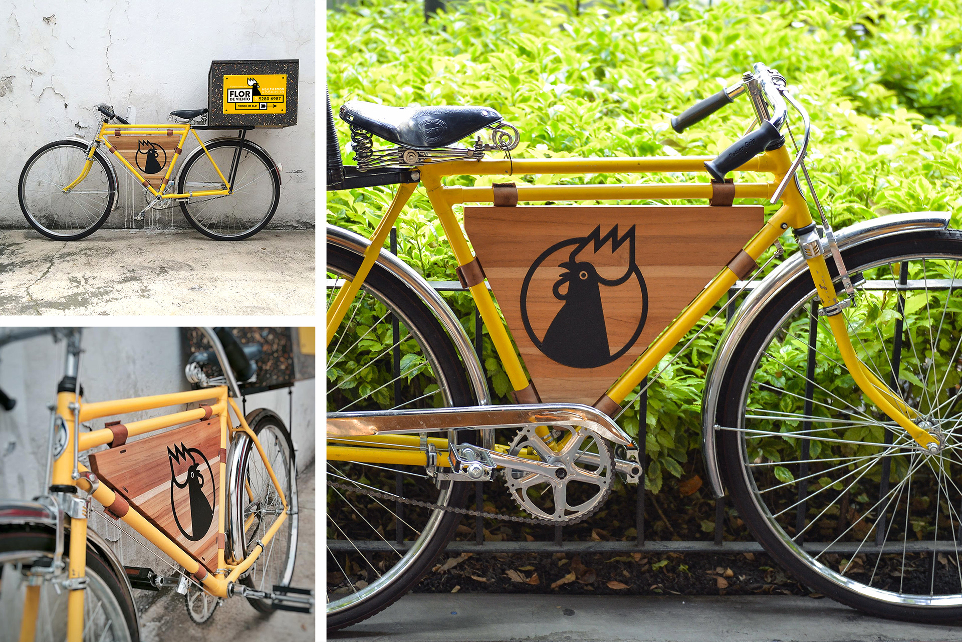
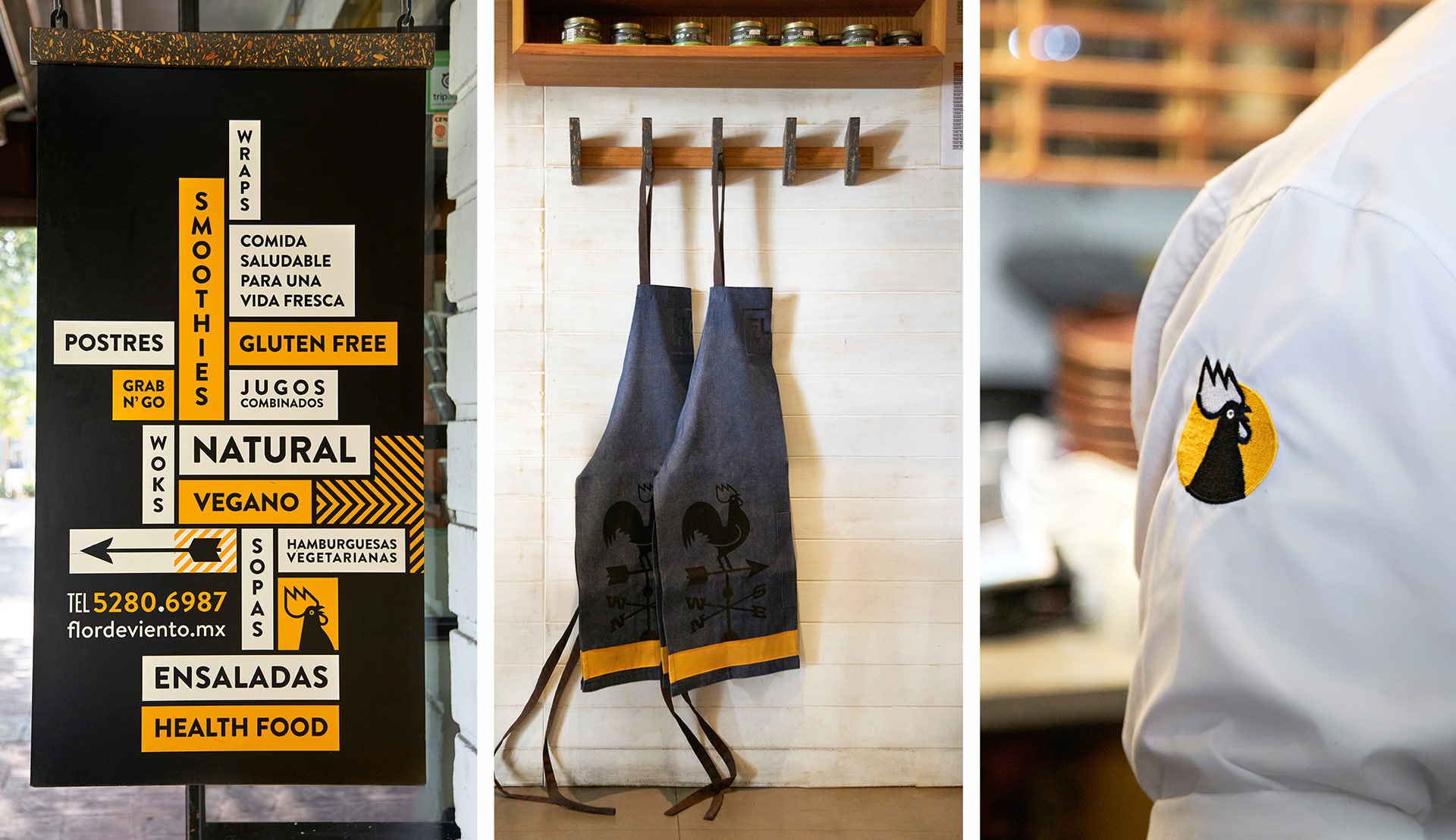
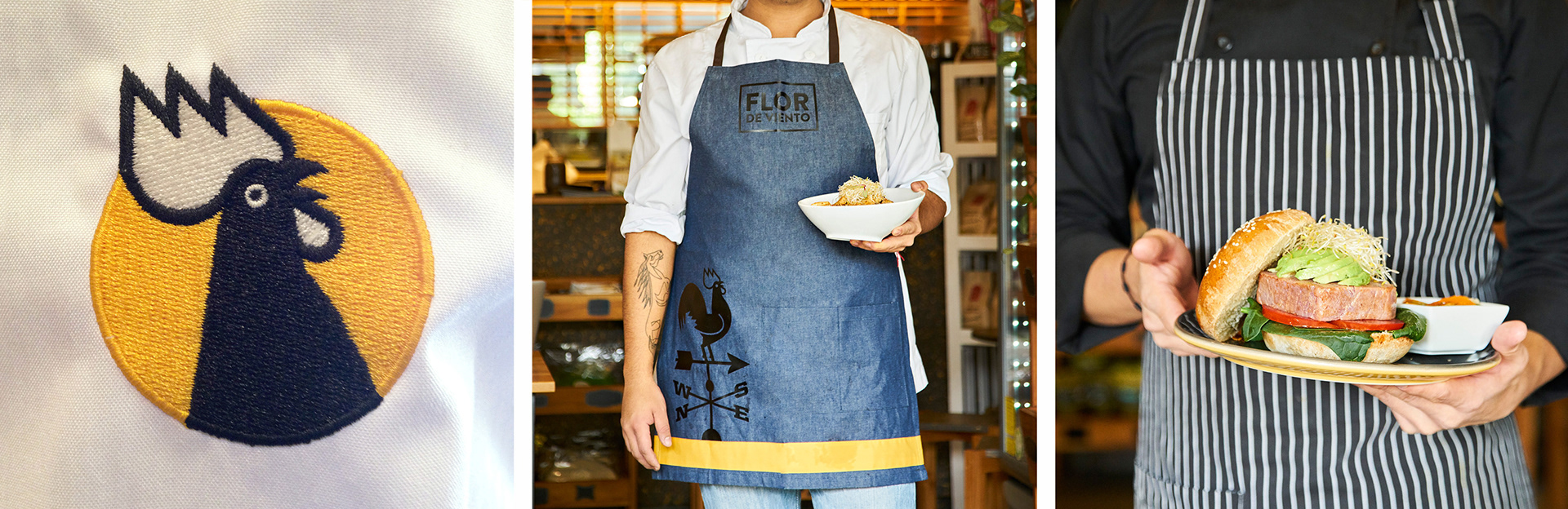
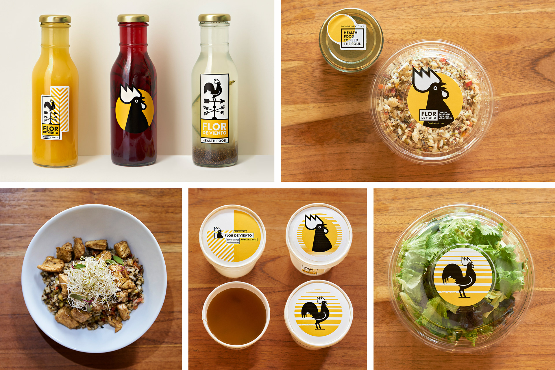
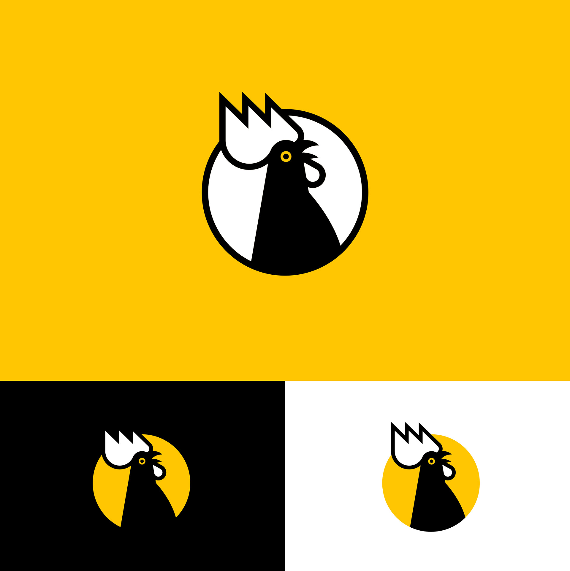
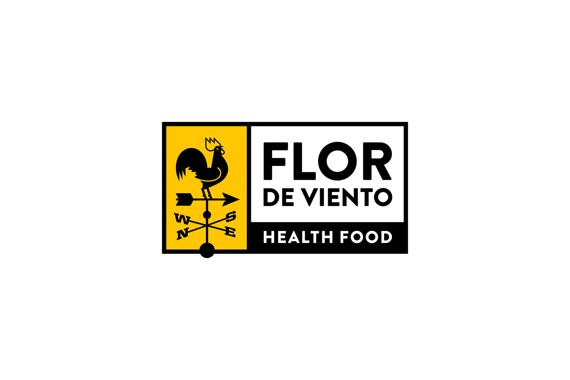
Flor de Viento is named after the wind rose, or wind flower, a graphic tool used by meteorologists to tell wind speed and direction as well as orientation. A famous representation of a wind flower is the weather vane with a decorative cock standing on the arrows that point to the cardinal directions: North, East, South, and West.
We decided to use this symbol to represent the organic nature of the food offered, suggesting farm produce.
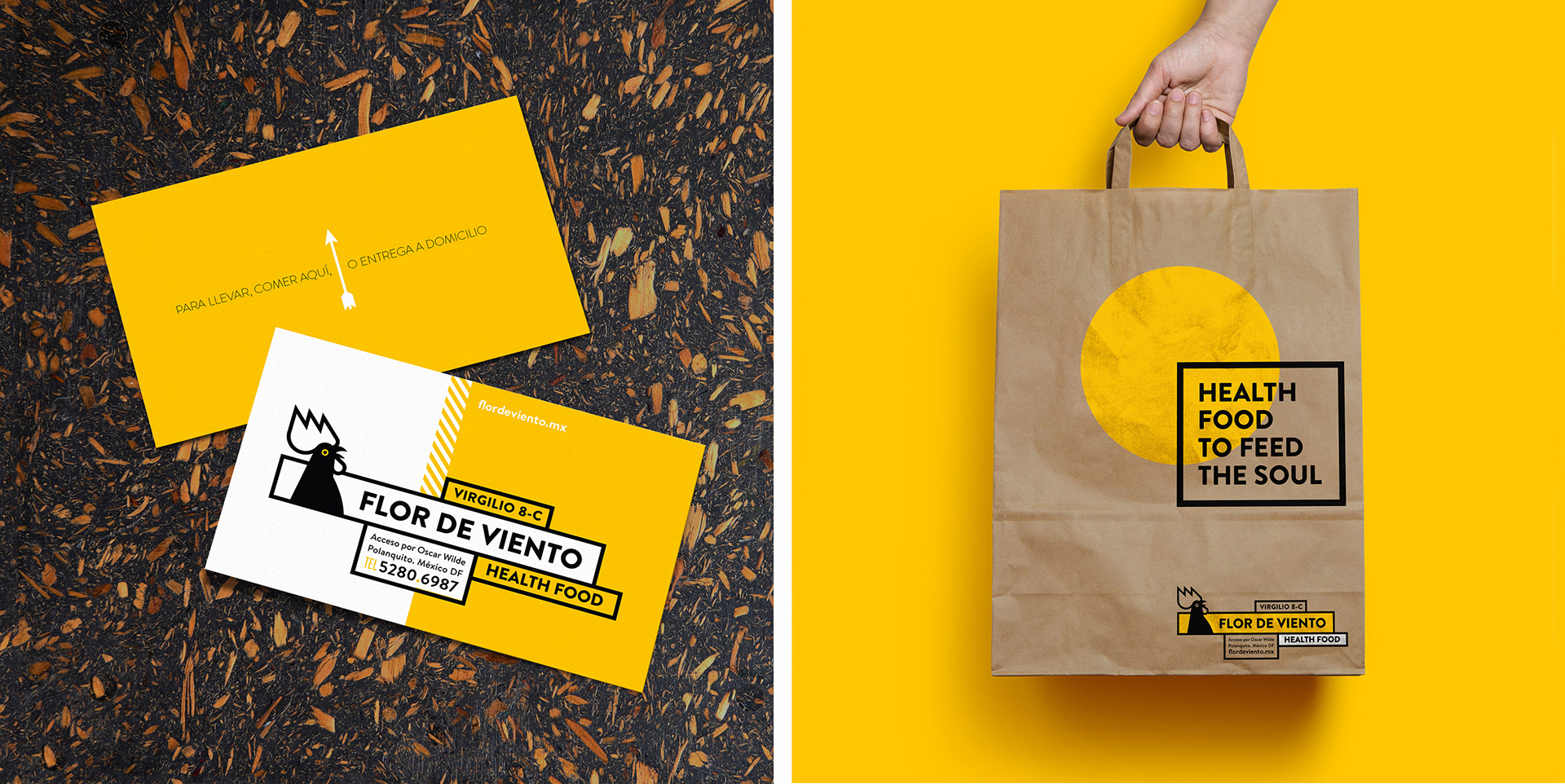
Another very important graphic element employed is the color yellow. Most restaurants that offer this type of food use the color green in their branding and even naming. We wanted to avoid that cliché and opted for a color that could suggest energy, light and a bright new start. Having the façade painted yellow also made the restaurant pop along most of the other dark colored facades.
We decided to use this symbol to represent the organic nature of the food offered, suggesting farm produce.
Another very important graphic element employed is the color yellow. Most restaurants that offer this type of food use the color green in their branding and even naming. We wanted to avoid that cliché and opted for a color that could suggest energy, light and a bright new start. Having the façade painted yellow also made the restaurant pop along most of the other dark colored facades.
Flor de Viento is a place where you can sit down and have a healthy salad and fresh juice, or stop by on your way to work after your morning run to pick up a delicious breakfast. Healthy food to go and delivery are key elements to the restaurant.
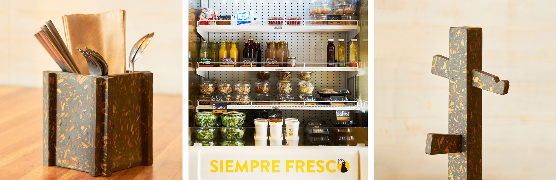
I teamed up with TUUX for the interior design of the restaurant using upcycled materials and wood to custom design and manufacture tables, chairs, a juice bar, coat hangers and ceramic plates.
Branding, Naming, Art Direction: Quique Ollervides.
Design: Quique Ollervides.
Interior Design and manufacture: TUUX, and Quique Ollervides.
Photos by Edgardo Contreras.